Tune
Lead UI Design
Visual Design
An interactive space for music lovers to express themselves and find community.
Introduction
Tune is a music streaming platform for music lovers who want to connect with their favourite artists and other fans. Developed as a UI-focused project, design decisions were made within an accelerated timeline with limited opportunity for formal research.
I conceptualized, designed, and prototyped Tune from the ground up, presenting the final outcome for stakeholders and fellow student designers.
Timeline
5 weeks
Role
Lead UI Design
Problem
Today's streaming platforms fall short for music lovers, lacking the personalization, community, and interactivity needed to truly express themselves and connect with artists.
Design Process
Who are we designing for?
Tune's design was driven by widely observed frustrations with existing streaming platforms. The process began by crafting a persona that captured the core music listener experience, using these insights to guide the design.

User persona
How can we solve the problem?
With a clear understanding of our user's pain points, I reframed the problem as an opportunity to guide the design:
"How might we make it easier for music lovers to express themselves, find community, and more easily connect with their favourite artists?"
Determining the core tasks.
To frame the design direction, I identified three core jobs our persona is trying to accomplish:
① Connect with artists and other music lovers.
② Easily organize her library.
③ Customize her profile.
Based on these jobs, I designed user flows for four core tasks:
① Browse personalized homepage.
② Read the community feed.
③ Filter library by albums.
④ Personalize profile.
Design Solutions
Brand tone.
The design process started with a moodboard to inspire the look and feel of the app, accompanied by adjectives and short descriptors to reflect the tone.

Moodboard
Design system.
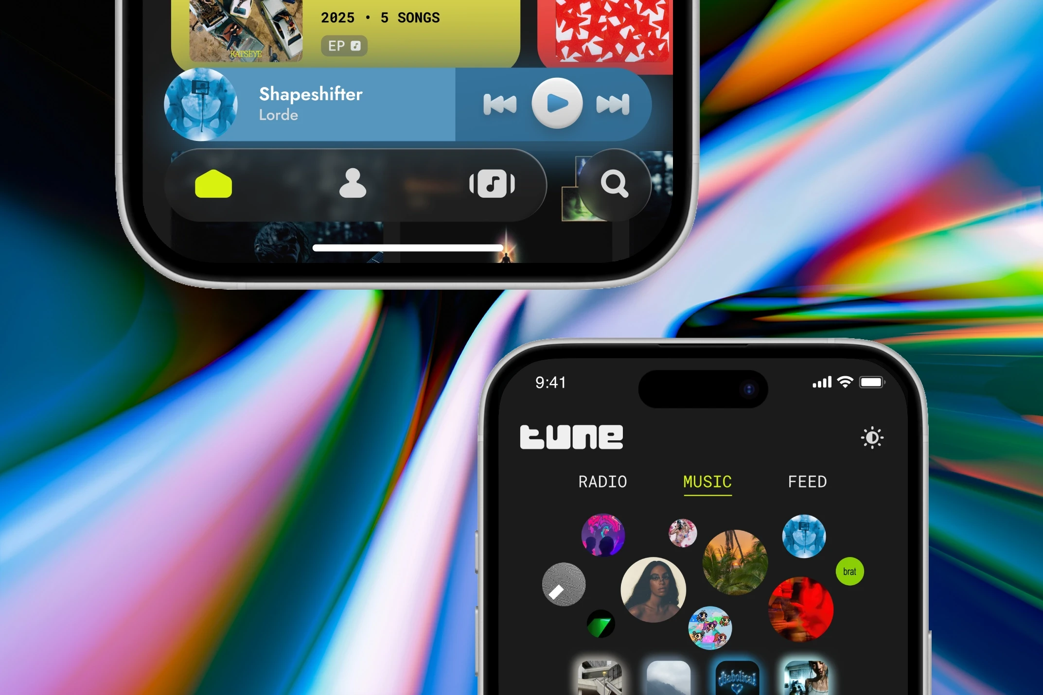
The type system was built around Jost and Roboto Mono for a modern, futuristic feel, paired with a simple palette of electric yellow-green and grey neutrals.
Using Figma, I designed the brand logo. the library page logo, and a suite of custom icons for the tab bar and other features.

Design system
Additionally, I created a component library to form the foundation of the high-fidelity prototype.
The bold aesthetic creates a fun, distinctive experience while maintaining clear visual hierarchy and intuitive navigation.
The final design combines a personalized homepage, community feed, and customizable profile, into a distinctive, expressive, and tangible platform.

High-fidelity wireframes
Alongside mobile frames, I also designed a tablet prototype for iPad, expanding Tune's experience beyond a single screen size.

